The Cuteness Strategy: Why Big Tech Is Softening AI's Image
Big Tech is designing AI agents with orb eyes and fluffy shapes to feel safe. Here's what the "cutewashing" trend means for brands launching AI products.

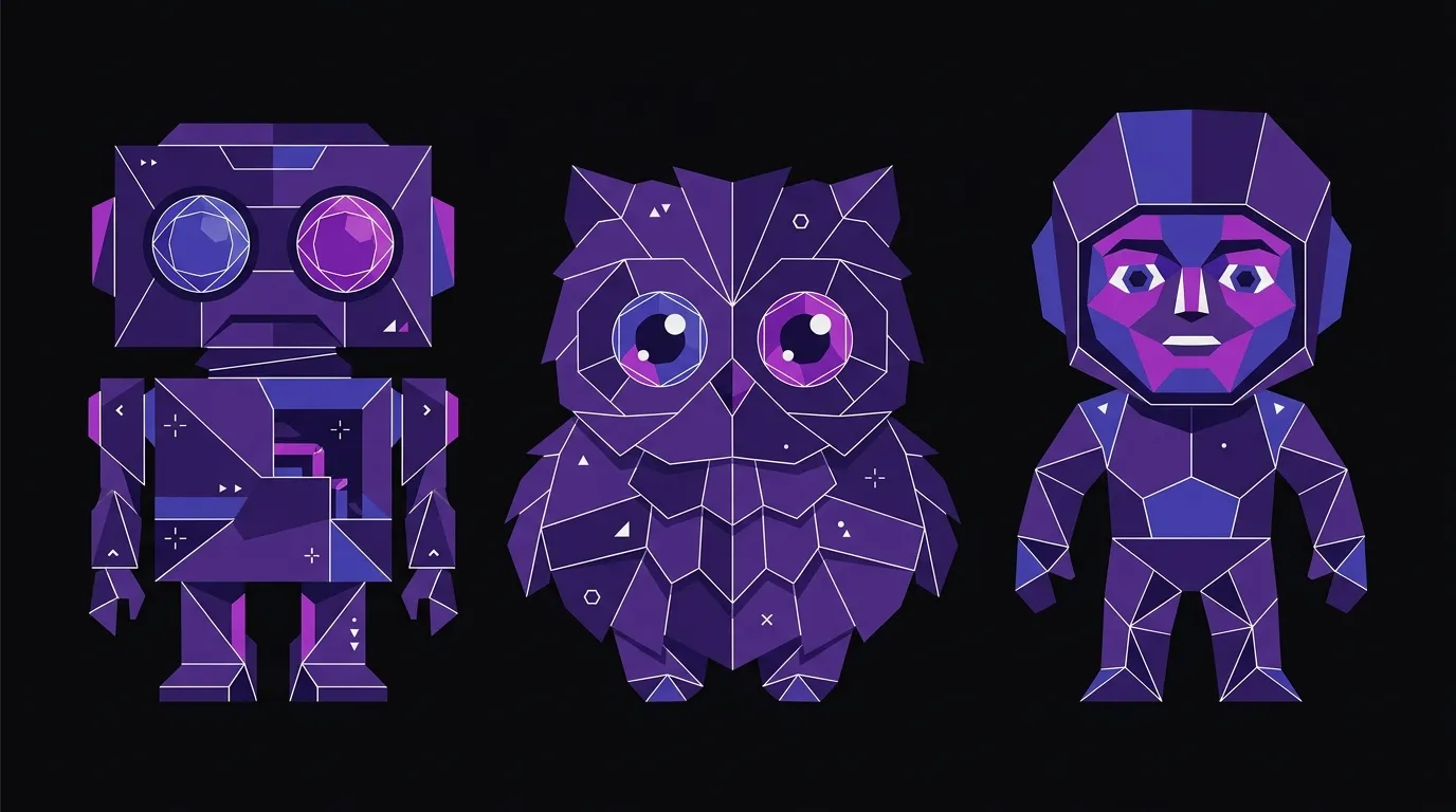
Something shifted in AI branding this fall. On August 11, SpaceXAI launched GrokBot — a suite of autonomous AI agents represented by shapes with giant orb-like eyes. On September 8, Meta followed with Muse, an agent that looks like a fluffy monster toy (and was also embedded into a Tamagotchi-style keychain). Then on September 29, OpenAI unveiled “dots,” a lineup of customizable Pixar-style characters the company described as “remarkably capable” and “remarkably cute.”
Three major players, three months, the same design instinct: make the AI look like something you’d want to hug.
As Fast Company reports, researchers and designers are calling this the era of the anthropomorphic AI mascot. And the pattern is deliberate — not accidental aesthetic overlap. Understanding why it’s happening, and where it goes wrong, matters a lot if you’re putting an AI-powered product or feature in front of customers.
Cute Is a Trust Signal — Until It Isn’t
The logic behind friendly AI design is straightforward. When tech companies want mass-market adoption of something unfamiliar, they reach for approachable aesthetics. That’s not new. What’s new is the stakes.
As Fast Company explains, Kevin Walker, chief creative officer at creative company Buck, describes a Big Tech “aesthetic gravity well” — a phenomenon where major platforms converge on the same visual symbols because those symbols signal safety within an established ecosystem. Anthony Cappetta, partner and creative director at Super Okay, puts it plainly: “It’s less about being original and more about being instantly legible and trustworthy at scale.”
That framing is honest about what’s actually happening. Cuteness isn’t primarily an artistic choice. It’s a conversion strategy. Soft shapes, big eyes, and pastel palettes all borrow from a deep well of human psychology — we’re wired to lower our guard around things that look young or harmless. Apply that to an AI agent that can autonomously execute tasks on your computer while you’re away from it, and you start to see the tension.
The UX Collective frames this directly: does cuteness make an AI easier to trust, or does it make it easier to trust without thinking? Those are not the same thing. Trust earned through transparency is durable. Trust manufactured through aesthetics is fragile — it cracks the moment the product does something the user didn’t expect.
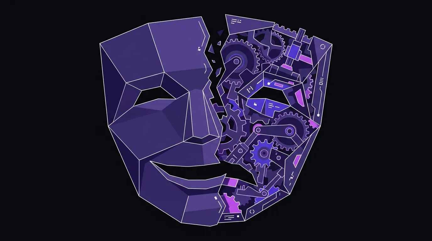
This is the core problem with what critics are calling “cutewashing.” The visual language implies safety and simplicity. The actual capability is neither simple nor fully understood by most users. When those two things diverge — and they will — the friendly face doesn’t cushion the fall. It makes it worse, because users feel deceived.
The Aesthetic Gravity Well Is Real, and It’s a Warning
Walker’s “gravity well” concept is worth sitting with. The mid-2010s Facebook brand — before the Meta rebrand — went through a similar gravitational pull toward flat, friendly illustration. Buck was involved in that work. The impulse then was the same as now: make a powerful, data-hungry platform feel warm and approachable.
What’s different today is that AI agents are genuinely autonomous in ways that earlier social platforms weren’t. GrokBot can work on tasks while your computer is closed. Muse is integrated into a physical keychain. OpenAI’s dots are designed to feel like companions. The gap between the visual promise (cute, safe, simple) and the functional reality (autonomous, data-accessing, capable of consequential errors) is larger than it’s ever been.
That gap is a brand liability. Not a design flaw — a brand flaw. Because brand is the sum of what you promise and what you deliver. When the visual promise outpaces what a user actually understands about the product, you haven’t built trust. You’ve borrowed it. And borrowed trust has to be paid back.
What This Means If You’re Launching an AI Feature
Most brands reading this aren’t OpenAI. But plenty of established companies are now building AI into their products, their customer service, their onboarding — and facing the same design question at a smaller scale. How do you make this feel approachable without being misleading?
A few things we’d actually recommend:
Match warmth to transparency, not to capability. Friendly visual design is fine — even good — when it’s paired with clear communication about what the AI can and can’t do. The problem isn’t the orb eyes. It’s the orb eyes with no plain-language explanation of what the agent has access to.
Don’t let the mascot do the trust-building work. A character or avatar can be an effective brand element, but it can’t substitute for honest UX copy, clear permission flows, and predictable behavior. If users have to rely on how something looks to decide whether to trust it, you’ve already failed the design brief.
Differentiation is available. Because every major AI player is converging on the same soft, round, friendly aesthetic, there’s actual white space in the opposite direction — clean, precise, confident design that signals competence rather than cuteness. That’s not the right call for every product, but it’s worth knowing the lane exists.
This is where branding work earns its keep: not just making something look good, but making sure the visual language is honest about what the product is. That’s harder than picking a friendly color palette, and it’s also more durable.
The Backlash Is Already Forming
Fast Company notes that cutewashing a largely untested technology “can spark its own backlash” — and that’s already visible in the response to some of these launches. When users recognize that friendly aesthetics are being used to smooth over legitimate questions about privacy, autonomy, and data access, the cute design stops being reassuring and starts being evidence of something to be suspicious about.
This is a lesson that applies at every scale. The brands that will come out of the AI adoption wave with intact reputations are the ones that used design to communicate honestly — not the ones that used it to lower defenses. Cute can be part of that. But it can’t be a substitute for it.
The orb eyes are a trend. Clarity is a strategy.
Brand design that earns trust
If you're building an AI product or feature, the visual language you choose has real consequences. We help brands make design decisions that hold up.