Rebranding as Repositioning: Visual Identity That Works
When your brand doesn't match what your business has become, it's a revenue problem. Here's what two recent rebrands reveal about identity and clarity.

Most businesses don’t rebrand because they’re bored with their logo. They rebrand because something has broken down between what they do and how the market sees them. The visuals are just where that breakdown — and the need for repositioning — becomes visible.
Two recent projects make this concrete. One is a tree-planting company that couldn’t figure out how to look like a business without looking like it was abandoning its values. The other is a cultural hub that needed to communicate an entire community’s way of experiencing the world. Both are branding problems. Neither is really about aesthetics.
The Gap Between Mission and Market Perception Is a Revenue Problem
GiftTrees plants trees through agroforestry projects in Sub-Saharan Africa — funded through opt-in contributions at restaurant checkouts and retail moments. As Creative Boom reports, the company is responsible for over five million trees planted so far, with an ambition to reach a billion. That’s not a charity — that’s a commercial operation with serious scale goals.
But the brand wasn’t carrying any of that weight. The problem, as Liverpool studio MOKSi identified it, wasn’t that GiftTrees was confused about its mission. It was that the brand lacked the confidence to be both profitable and good at the same time. The old identity kept the company stuck in a visual register closer to a nonprofit — apologetic, soft, slightly guilty — which made it harder to attract the commercial partners and B2B relationships it needed to actually grow.
The brief MOKSi received, according to founder and creative director Rich Pay, was essentially: how do we bring people, planet, and profit together under one brand that speaks to everyone the same way? That’s a positioning question. The visual identity was just the answer made tangible.

MOKSi’s starting point was a value proposition — “impact made easy” — and worked outward from there. Research, competitor analysis, and workshops helped them avoid the visual clichés of sustainability branding: the muted earth tones, the guilt-trip messaging, the saintly imagery that makes people feel overwhelmed rather than invited. The result was a brand built around positivity and clarity, one that says GiftTrees is a business doing good, without hedging about either half of that sentence.
The lesson isn’t about color palettes. It’s that the visual identity was preventing a business conversation from happening. Fix the brand, and the business development becomes possible.
An Identity Built From the Inside Out Does More Than Reference Its Community
DeafCity Hub is a different kind of problem — and a sharper example of what it means to build an identity from the inside out rather than the outside in.
As It’s Nice That reports, DeafCity Hub is a purpose-built cultural space dedicated to the Deaf community, with a year-long pilot campaign designed to demonstrate the value of Deaf cultural spaces for both Deaf and hearing audiences. The identity was created by London studio Templo, and the brief was not simply to make something that looked distinctive — it was to build a visual language rooted in how Deaf people actually experience and communicate the world.
Templo’s answer was to use motion-tracking software to capture real British Sign Language gestures, feeding those movements directly into the brand’s visual system. The logo is modular, flexible, and shaped by actual hand movement — ten letters, ten fingers. When it moves, it mimics a waving motion derived from captured hands. According to It’s Nice That, the result carries “a warmth that is immediately recognisable and approachable.”

What’s worth noting is that Templo didn’t just make something that referenced sign language visually. They made the brand’s behavior — how it moves, how it changes — a direct expression of its community’s way of communicating. That’s the difference between decoration and identity. Decoration sits on top of a business. Identity comes out of it. The bold palette — pink and orange — was also a deliberate strategic choice: the colors were selected, as It’s Nice That notes, to intentionally stand out from other Deaf-led identities, giving DeafCity Hub visibility and energy rather than blending into a category.
Where GiftTrees needed visual permission to be commercial, DeafCity Hub needed its identity to be constitutive — not a reference to its community but an expression of it. Different briefs, same underlying discipline.
Both Rebrands Prove the Same Thing: Clarity Outperforms Decoration
These two rebrands are doing different things, but they share the same underlying move: the visual identity is being used as a tool for clarity, not decoration.
GiftTrees needed visual permission to be taken seriously as a commercial entity without abandoning its purpose. DeafCity Hub needed an identity that wasn’t just about Deaf culture but made of it. In both cases, the design work is solving a business or organizational problem that couldn’t be solved with copy or positioning statements alone. The visual system had to do the work.
The corollary is straightforward: a rebrand brief written purely in aesthetic terms is the wrong brief. “We want to feel more modern” is not a brief. The real brief is always about what the business needs permission to become. MOKSi didn’t get hired to make GiftTrees look nicer; they got hired to give GiftTrees the confidence to sell. Templo didn’t get hired to make DeafCity Hub look bold; they got hired to make its identity inseparable from its mission.
That distinction is what separates a rebrand that changes the business from one that just changes the logo.
A Branding Problem and a Business Problem Are Usually the Same Problem
Here’s a useful diagnostic:
If your best clients found you despite your brand, not because of it — that’s a branding problem. You’re growing on word-of-mouth and relationships while your public-facing identity is doing nothing to help. You’re leaving inbound opportunities on the table.
If you’re attracting the wrong clients or the wrong price conversations — that’s almost always a brand positioning problem. What the brand communicates is attracting people who don’t fit what you actually offer. A rebrand doesn’t just change how you look; it changes who raises their hand.
If you feel hesitant to send people to your website or hand over a business card — that’s the GiftTrees problem. The brand lacks confidence, so you do too. That hesitation has a cost.
The 30-second test: Pull up your homepage and your three most recent client wins side by side. If the brand doesn’t reflect the wins, that’s the brief. The gap you’re seeing is real, and it’s costing you.
The Fix Is Accuracy, Not Beauty
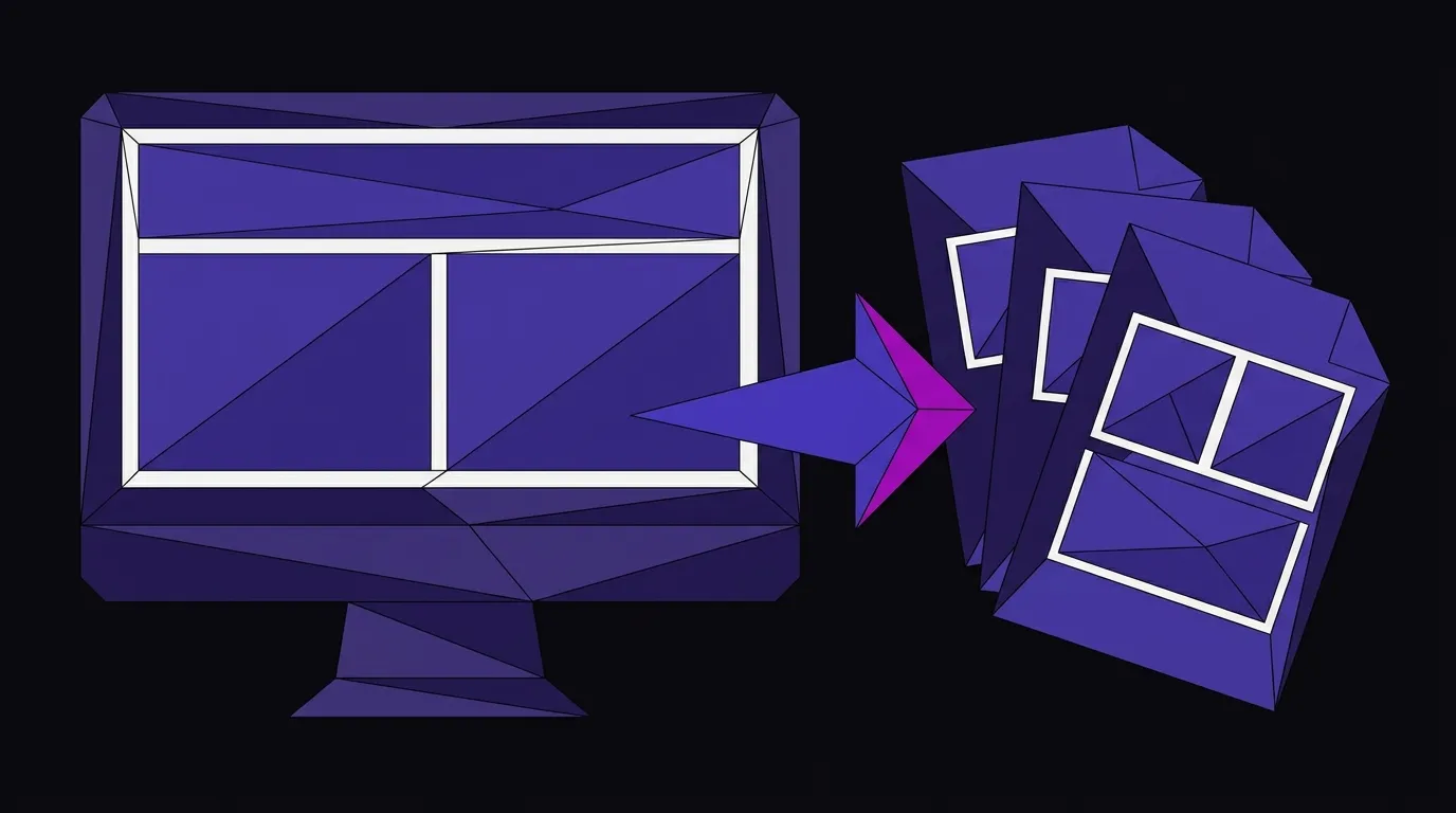
The pattern is consistent: businesses operating for years with a brand that made sense at launch, but no longer reflects what they’ve become. The brand is still pointing at version one of the business, and the business is on version four. That gap is invisible to the owner until someone outside the company names it — and then it’s obvious.
This is exactly the kind of problem our branding and identity work is built to solve: not making a brand prettier, but making it accurate. Accurate to the service, the client, the price point, the ambition. A brand that matches what the business has actually become can do things the old one never could — attract the right prospects, support a higher price conversation, and give the team confidence to put it in front of anyone.
What closes the gap isn’t making the brand more beautiful. It’s making it more accurate. That’s the only rebrand worth commissioning.
Your Brand Should Match Your Business
If your identity is pointing at an older version of what you do, we can close that gap. Our branding work starts with the business problem, not the aesthetic one.