Foldable Interfaces and Vertical-First Design: What Brands Need to Know
Apple's iPhone Duo and iOS 27 are rewriting mobile UI conventions. Here's what foldable screens mean for your brand's web design and navigation strategy.
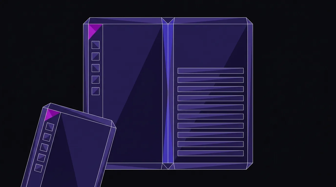
The iPhone dock hasn’t moved in nearly two decades. Since the original iPhone launched in 2007, that row of icons has sat at the bottom of the screen, horizontal, right where Apple put it. As Fast Company reports, the iPhone Duo and its iOS 27 operating system just ended that streak — moving the dock to the side of the screen and reorienting the entire interface around a vertical axis.
That is not a cosmetic tweak. When Apple says it “had to adjust every app’s layout and reconsider long-standing iPhone design principles,” that is a signal worth taking seriously. A form factor shift at Apple’s scale tends to become the new baseline expectation — for apps, for mobile web, and eventually for the assumptions baked into every responsive design framework in use today.

The physics of a foldable screen change everything
The iPhone Duo opens to a 7.6-inch inner display and closes to a 5.4-inch outer display. As 3D Printing Industry notes, both screens share the same aspect ratio, so content scales proportionally between the two — a deliberate engineering choice that has direct consequences for how content must be structured.
When a phone unfolds longer than it is tall, horizontal UI patterns stop making ergonomic sense. Apple’s solution is to anchor controls to the side rail, keeping them within thumb reach regardless of whether the phone is open or closed. The status bar — Wi-Fi, signal, battery — was condensed from a horizontal row of three icons into a single compact circle. When unfolded, two home screens can display simultaneously, and apps like Mail show inbox and message thread side by side in full-screen mode, as Fast Company reports.
The underlying logic is simple: a taller canvas rewards vertical content flow, and side-anchored controls reduce the stretch that makes large-screen phones awkward to use one-handed. These are not arbitrary aesthetic choices. They are responses to physical constraints, and those physical constraints are now shipping in a $1,999 consumer device.
Your breakpoints were never tested for this
Most responsive web design today is built on assumptions that were formed around the portrait-orientation smartphone. Breakpoints are typically defined by width. Navigation bars sit at the top or bottom. Content stacks vertically as a fallback for small screens, not as a primary design intention.
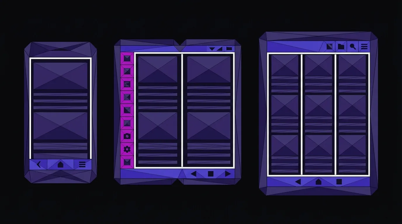
Foldable screens break those assumptions in two directions at once. The outer display is a conventional narrow phone. The inner display is closer to a small tablet — but taller and thinner than most tablet breakpoints are designed to handle. A site that looks fine on a standard smartphone and fine on an iPad may look awkward at neither-nor foldable proportions.
The practical implications for brand owners:
Navigation placement needs to be rethought. Fixed bottom nav bars — common on mobile web — become harder to reach when a screen gets taller. Side-rail or top-anchored navigation patterns hold up better across foldable proportions. This is exactly the logic Apple applied to iOS 27, and it applies to web UI just as directly.
Content hierarchy has to work at two sizes simultaneously. The iPhone Duo’s dual-screen capability means a user might be reading your site on the 5.4-inch outer display and then unfold to the 7.6-inch inner display mid-session. Content that reflows gracefully between those two states — without losing context or forcing a reload — will hold the user’s place. Content that doesn’t will feel broken.
Horizontal scroll patterns are a liability. Carousels, horizontal product sliders, and side-scrolling galleries are already problematic on standard phones. On a taller foldable display, they fight the natural direction of the screen. Vertical-first content structures — stacked cards, expandable sections, scroll-based reveals — are better bets going forward.
The hinge forced Apple to question everything it had stopped questioning
It is worth pausing on what Apple built to make this device work physically. The iPhone Duo’s hinge is assembled from more than 100 components. The cover uses 3D printed recycled titanium with a micro-blasted finish. During manufacturing, as 3D Printing Industry reports, AI algorithms match each individual hinge to its best-fit housing, and a confocal laser scans every unit to 3D print micro-layers of a custom photopolymer to eliminate residual waviness in the display.
That level of precision engineering exists to solve one problem: making a screen that bends without creasing, warping, or failing. And in solving it, Apple was forced to revisit UI decisions it had not touched in nearly two decades — the dock moved, the status bar was redesigned, every app layout was reconsidered. The same way the hinge’s 100-component constraint forced a rethink of every UI element touching it, a layout audit forced by new screen proportions will surface assumptions your team has never questioned. The constraint is productive precisely because it is unavoidable.
Brand owners and marketing leads should apply the same pressure to their own digital presence. When was the last time your site’s navigation was questioned from first principles rather than just updated? If a new device category exposes a flaw in your layout, the flaw was already there — the device just made it visible.
The habits foldables train will outlast the devices
Here is the part that gets missed in most coverage of foldable phones: you do not need to own a foldable device for vertical-first design to matter to your users. The habits that foldable UIs are training — side-anchored controls, dual-pane content, taller proportions — will influence how users expect all mobile interfaces to behave.
The skeptic’s objection is fair: foldables are expensive and still a small share of the market. But consider how quickly the original iPhone’s bottom-anchored dock convention spread. Within two to three years of the first iPhone’s release, that navigation pattern had migrated to Android apps, third-party iOS apps, and eventually the mobile web — not because those platforms were required to adopt it, but because users had been trained to expect it. The same dynamic is already in motion. What starts as a foldable-specific pattern becomes the expected pattern.
The brands that adapt their design systems early will have a head start when the expectation catches up.
Where to start
You do not need to rebuild your site today. But a few concrete steps are worth taking now:
Audit your mobile breakpoints. Check how your site renders at tall, narrow proportions approximating the Duo’s outer display (around 390px wide) and at wider proportions closer to the inner display (around 600px wide) — both significantly taller than typical phone viewports. Most sites have never been tested at these dimensions.
Reconsider fixed navigation. If your mobile site uses a fixed bottom bar, test what happens when the viewport gets significantly taller. Does it still feel reachable? Does it obscure content?
Plan for dual-pane content. If your site has a list-detail pattern — product categories and product pages, blog index and post, inbox and message — think about whether those pairs could display side by side on a wider inner display. That is a meaningful UX improvement for foldable users, and it is achievable without a full redesign.
If you are building or rebuilding a site, this is exactly the kind of forward-looking decision that separates a site designed for today’s devices from one that will need a redo in two years. Our web design and development work is built on hand-coded static foundations, which means breakpoint logic and layout decisions are explicit and intentional — not inherited from a framework that was never tested against a 7.6-inch foldable display.
The UI decisions Apple made to support the Duo are already reference points for every designer working on a mobile-first product. Vertical-first is not a trend to watch — it is a direction to plan for.
Build a site ready for any screen
We hand-code every site from scratch, so your layout decisions are intentional — not inherited from a framework built for yesterday's devices.