Container Queries and Component-First Web Design
Container queries let web components respond to their own space, not just screen size. Here's why that distinction matters for scalable design systems.
Most conversations about responsive web design still start and end with screen size. Mobile, tablet, desktop — pick your breakpoints and ship. That framing made sense in 2012. It’s a liability now, and a CSS feature that’s been sitting at 94% browser support for years explains exactly why.
As Smashing Magazine reports, 86% of developers know what container queries are — but only 41.4% actually use them. The gap isn’t ignorance. It’s a mental model problem, and that problem is costing brands real money in maintenance and redesign cycles.
Media Queries Answer the Wrong Question
Here’s the core issue. When you write a traditional media query, you’re asking the browser one thing: how wide is the viewport right now? That’s it. The browser looks outward, at the full screen, and applies styles accordingly.
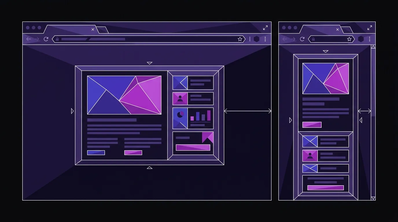
The problem surfaces the moment your layout gets complex. Imagine a card component placed inside a narrow sidebar on a 1920px desktop screen. The viewport is wide, so your min-width: 1024px media query fires — and your card tries to render in a horizontal, two-column layout inside a space that’s only 300px wide. The result is broken type, cramped images, or overflowing content. The media query did exactly what you told it to do. You just asked it the wrong question.
As Smashing Magazine’s Victor Ayomipo puts it, media queries are “dumb” — not as a concept, but in the sense that they know far less about your component’s actual context than most developers assume.

Container Queries Answer the Right One
Container queries flip the direction. Instead of looking at the viewport, a component looks at its own parent container and asks: how much space do I actually have right now?
The syntax change is small. The architectural shift is significant:
.card-wrapper {
  container-name: card;
  container-type: inline-size;
}

@container card (min-width: 450px) {
  .card {
    display: flex;
    flex-direction: row;
  }
}
That card component no longer cares about the screen. It cares about its wrapper. Put it in a full-width content area and it goes horizontal. Drop it in a sidebar and it stacks vertically. Same component, same CSS, zero special-case overrides. The component is genuinely reusable because it adapts to wherever it lives — not to an approximation of where it might live based on screen width.
This is what component-first design actually requires. You can’t build a real design system out of components that only behave correctly in one layout context.
The Technical Debt Brands Don’t See Coming
Here’s the business consequence that doesn’t get enough attention: viewport-only responsive design creates compounding technical debt — and it stays invisible until a redesign surfaces it, at which point the cost is a rewrite, not a refactor.
Every time your marketing team wants to add a new page section, move a widget, or repurpose a component in a different layout, a developer has to audit the media queries to make sure nothing breaks. Over time, stylesheets accumulate exceptions, overrides, and !important patches. The codebase gets harder to touch. Redesigns become expensive not because the design is complex, but because the CSS architecture was built on assumptions that no longer hold.
Container queries reduce that debt by making components self-contained. A component that manages its own layout logic doesn’t need to be re-examined every time the surrounding page changes.
Victor Hwang, the web designer behind the Mater website redesign covered by It’s Nice That, makes a related point from the sustainability angle: “Knowledge builds up over time in all the tweaks you make, and throwing away a website is like destroying a whole ecosystem that’s built up over years.” He’s arguing for updating and extending existing sites rather than scrapping them. That ecosystem is the accumulated CSS logic — and it only survives context changes if components are self-contained. A site built on viewport-only component logic doesn’t accumulate knowledge; it accumulates fragility. Every time a component moves to a new layout context, the ecosystem Hwang describes starts to crack. Container queries are the architectural prerequisite for the kind of longevity he’s talking about — they’re what allows a site’s CSS to absorb change rather than resist it.
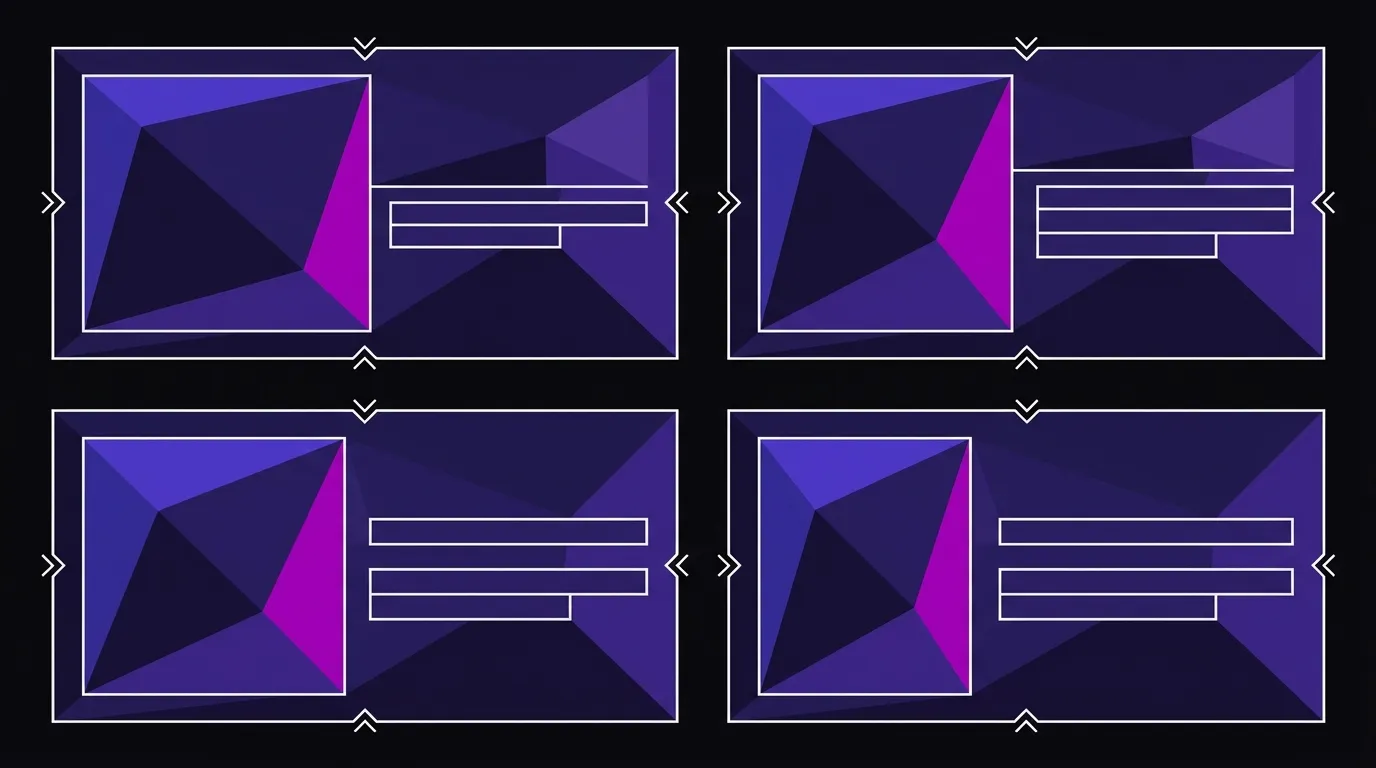
Media Queries Own the Page; Container Queries Own the Component
Container queries don’t replace media queries. Both belong in a well-built site, and knowing which to reach for is the actual skill.
Use media queries when you’re controlling the overall page layout — the number of columns, whether a sidebar appears at all, top-level navigation behavior. These are genuinely viewport-level decisions.
Use container queries when you’re styling a component that might appear in multiple layout contexts — cards, product tiles, testimonial blocks, feature callouts, pricing tables, anything that gets reused. These components should own their own responsive logic.
The distinction maps cleanly: page structure is a viewport decision; component behavior is a container decision. The mistake most teams make is using media queries for both jobs. It’s also the most plausible explanation for the 41.4% adoption gap: developers who’ve tried container queries but default back to media queries are likely applying them to page-level layout decisions where the difference is invisible, rather than to reusable components where it’s immediately obvious. It works until it doesn’t — and when it stops working, the fix is a rewrite rather than a tweak.
For brands building out a web design and development project from scratch or refreshing an aging site, this distinction is worth getting right at the architecture stage. Retrofitting container queries into a stylesheet full of viewport-based component overrides is possible, but it’s slower and messier than starting with the right mental model.
One Component Conversion Proves the Case
If your site is running on a design system — or if you’re planning one — audit how your reusable components currently handle layout. If every component’s responsive behavior is controlled by viewport breakpoints, you have a fragility problem waiting to surface.
The fix isn’t to rewrite everything at once. Pick one high-reuse component — a card, a feature block, a testimonial — and convert it to container-query-based layout. Test it in two or three different page contexts. The difference in behavior will be immediately obvious, and the maintenance improvement will be apparent the next time someone asks to use that component somewhere new.
Any design system built on viewport-only component logic will require a rewrite before it requires a redesign. That’s the cost of the wrong mental model — and the next time your marketing team asks to drop a card component into a sidebar, the answer should be yes, not a two-day audit.
Build a Site That Stays Flexible
We hand-code sites with component architecture built to last — no bloat, no viewport-only fragility. If your current site is getting harder to change, that's worth a conversation.