Accessibility Isn't a Feature—It's the Foundation of Good Design
Most designers care about accessibility but still ship sites that exclude users. Intention isn't enough—here's what structural commitment looks like.
Most designers are good people. As Alan Dalton writes in A List Apart, he has never heard a designer say “I don’t care if somebody can’t read this text” — and yet websites that exclude users are everywhere. Low-contrast text. Layouts that collapse under keyboard navigation. Interactions that assume a mouse and two functional hands. The designers who built those sites probably cared. They just didn’t build accessibility into their process from the start.
That gap — between caring and executing — is the real problem. And closing it is not about adding an accessibility pass at the end of a project. It’s about treating inclusion as a structural requirement, the same way you treat responsive layout or page speed.
Intention without strategy is just a good mood
Antiracist economist Kim Crayton put it plainly, as quoted in Eva PenzeyMoog’s Design for Safety excerpt in A List Apart: “intention without strategy is chaos.” PenzeyMoog wrote that in the context of designing safe technology for vulnerable users, but the principle maps cleanly onto accessibility. Good intentions don’t produce accessible designs. A repeatable process does.
Dalton points to the same structural problem from a different angle. The reason designers exclude users, he argues, isn’t indifference — it’s cognitive overload. Designers are expected to hold an enormous amount of guidance in their heads simultaneously: visual hierarchy, performance, SEO, brand standards, responsive behavior, and on top of all of that, accessibility. Something gets dropped. Accessibility, because it rarely shows up in a client brief or a visual mockup, tends to be what gets dropped.
His proposed fix draws on Jakob Nielsen’s sixth usability heuristic: recognition over recall. Rather than asking designers to remember every accessibility guideline at the moment of execution, the goal is to make accessibility issues visible during the design process — surfaced by tools, checklists, and personas that are already in front of you. It’s a workflow argument, not a values argument.
Real users, not edge cases
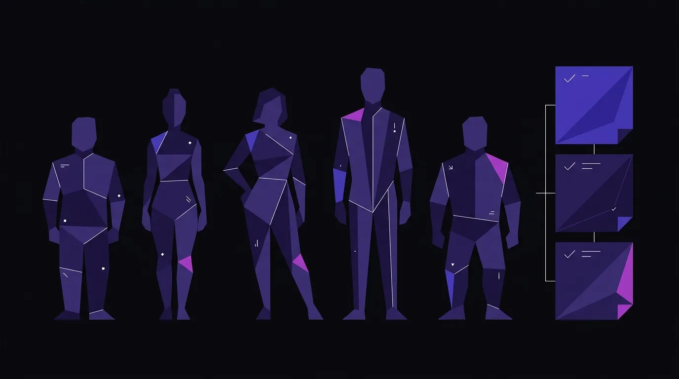
One of the most effective tools Dalton highlights is the use of accessibility personas — composite user profiles built around specific disabilities and real usage patterns. Dalton draws on personas developed in the field, and the named examples he walks through in his piece make the abstract concrete fast.
Consider a few of them (as described in Dalton’s article). Vishnu, an engineer with low vision, needs adjustable screen settings and plain language. Trevor, a high school student with autism, depends on consistent navigation patterns — when the layout shifts unexpectedly, he’s lost. Lea, an editor living with fatigue and pain, needs navigation links at the top of the page and no drop-down menus that require sustained mouse precision. Carol, a grandmother with macular degeneration, just wants the text a little larger.
None of these users are rare. None of their needs are exotic. And every one of them would be excluded by a site built without those needs in mind. The business case is not abstract: when a user can’t read the text, complete a form, or navigate to the page they need, they leave. That’s a lost customer, not a statistic.
When we work on web design and development projects, accessibility isn’t a line item we add when a client asks for it. It shapes decisions at the structure level — semantic HTML, heading hierarchy, color contrast ratios, focus states — before a single visual asset is finalized. Retrofitting accessibility onto a finished design is expensive and incomplete. Building it in from the beginning costs almost nothing extra.
AI can help, but it can’t replace the commitment
There is a growing conversation about whether AI tools can close the accessibility gap automatically. Aaron Gustafson’s piece in A List Apart takes a measured position: AI has genuine potential in accessibility, but the current state is limited and the risks are real.
The most credible near-term use case is alt text. Computer vision models are improving, and Gustafson argues that even imperfect AI-generated alt text can serve as a useful starting point — something for a human author to correct rather than write from scratch. The human-in-the-loop model is the key phrase here. AI assists; a person decides. That framing is exactly the kind of structural process Dalton is calling for — AI functioning as a recognition tool that makes accessibility issues visible during the design workflow, not a substitute for intentional design decisions made upstream.
More speculative, but worth watching: Gustafson’s vision of AI helping users interact with complex data visualizations — asking a browser to simplify a chart, transpose colors for a specific form of color blindness, or convert a graph into a spreadsheet. That’s not a product that exists yet in any reliable form. It’s a direction.
What AI cannot do right now is replace structural accessibility decisions made during design. It can flag missing alt text. It cannot fix a navigation architecture that was never designed for keyboard users. It can suggest color alternatives. It cannot undo a layout that buries critical information in a third-level drop-down menu. The tools are useful at the margins. The foundation still has to be built by people who understand what they’re building.
The competitive argument is real
Accessibility is sometimes framed as a compliance issue — something you do to avoid legal exposure under the ADA. That framing is too narrow, and it produces the wrong kind of motivation. Compliance thinking leads to minimum-viable accessibility: just enough to avoid a lawsuit, not enough to actually serve users.
The better frame is competitive. A site that works for Vishnu, Trevor, Lea, and Carol also works better for everyone else. Clear contrast helps users reading in sunlight. Consistent navigation helps first-time visitors who haven’t learned your site’s patterns yet. Keyboard accessibility helps power users who prefer it. Simpler screens, as Dalton’s personas make clear, are easier screens — full stop.
Brands that build accessible sites signal something to every user who lands on them: we thought about you. That signal is not lost on people. It is, in fact, a brand statement. And it’s one that most of your competitors aren’t making.
The gap between good intentions and accessible execution is real, but it’s not mysterious. It closes when accessibility moves from an afterthought to a structural commitment — embedded in the design process, visible in the workflow, and treated as a baseline rather than a bonus.
Build a Site That Works for Everyone
Accessibility decisions happen at the structure level, not the finish line. We build it in from the start.