Packaging Is the Pitch: Why Your Box Is Your Best Salesperson
Your packaging is the one brand message no algorithm can skip. Here's why intentional packaging design is the highest-return investment for product brands
A rich burgundy box. Shimmering gold artwork. A woodland nymph reaching toward a feathered hen. Open it and six eggs sit in a custom-shaped interior that makes the whole thing feel like unwrapping a gift. That’s a carton of eggs — one of the most undifferentiated products on any grocery shelf — and the packaging turns it into a small luxury worth pausing over.
Most established brands treat packaging as a production task that follows the brand refresh: finalize the logo, update the website, then hand the new assets to a supplier and ask them to put it on the box. That sequencing is the mistake. Packaging isn’t downstream of the brand — it is the brand, at the one moment that matters most. And the brands getting this right right now are proving it from opposite ends of the aesthetic spectrum.
The shelf encounter is the one moment no algorithm controls — and most brands waste it
At a Nicer Tuesdays talk in London, designers George Wu and Cecilia Serafini of Mother Design — the independent brand and design company behind work for IKEA, KFC, and PG Tips — put the constraint plainly: “packaging is the only thing a designer gets to say to a customer.” No landing page to scroll. No video to watch. No salesperson to explain the backstory. The box, the label, the structure — that’s the entire conversation.
This is what separates packaging from every other channel in your marketing mix. Ads get skipped. Emails get deleted. Social posts get filtered by an algorithm. Packaging shows up exactly when a customer is standing in front of your product, ready to make a decision — and it gets their full attention at that moment with no media spend required to place it there. Mother Design’s portfolio runs from soda cans to organic period care, and across all of it, their consistent argument is that branding communication has to be loud and clear because you get one shot — not one shot per campaign, but one shot per shelf encounter.
Wasting that shot by defaulting to the category aesthetic is the most common and most expensive mistake an established brand makes. It’s not a production failure. It’s a strategic one.
Owning a visual language beats chasing a category aesthetic
As The Dieline reports, illustrator Bill Rebholz came to CPG packaging from a background in graffiti, sign painting, and mural work — not from formal packaging design training. What he brought was a genuinely distinctive visual language: exaggerated and distorted proportions, bold geometric interpretations, hand-lettering filled with character. The brands he’s worked with, including soda label work for Ggiata, chose him precisely because that aesthetic couldn’t be mistaken for anyone else’s.
Here’s the tension worth sitting with: Mother Design’s “loud and clear” principle might seem to argue for simplicity — clean layouts, readable hierarchy, nothing that competes with the product message. Rebholz’s maximalist illustration style looks like the opposite move. But both approaches are actually doing the same thing: rejecting the category default. A brand that looks like a better version of the category leader is asking customers to do comparative work at the shelf — reading claims, comparing fine print, weighing options. A brand with a distinct visual language makes that comparison irrelevant. Customers feel the difference before they process a single word.
Every grocery and beverage aisle has a dominant aesthetic that most brands drift toward — the “clean and minimal” look, the “rustic and artisanal” look, the “clinical and scientific” look. Those aesthetics are readable, but they’re not ownable. When your packaging looks like a version of what the category already does, you’re asking customers to read the fine print to understand why you’re different. When your packaging has a distinct visual language, customers feel the difference before they read anything.
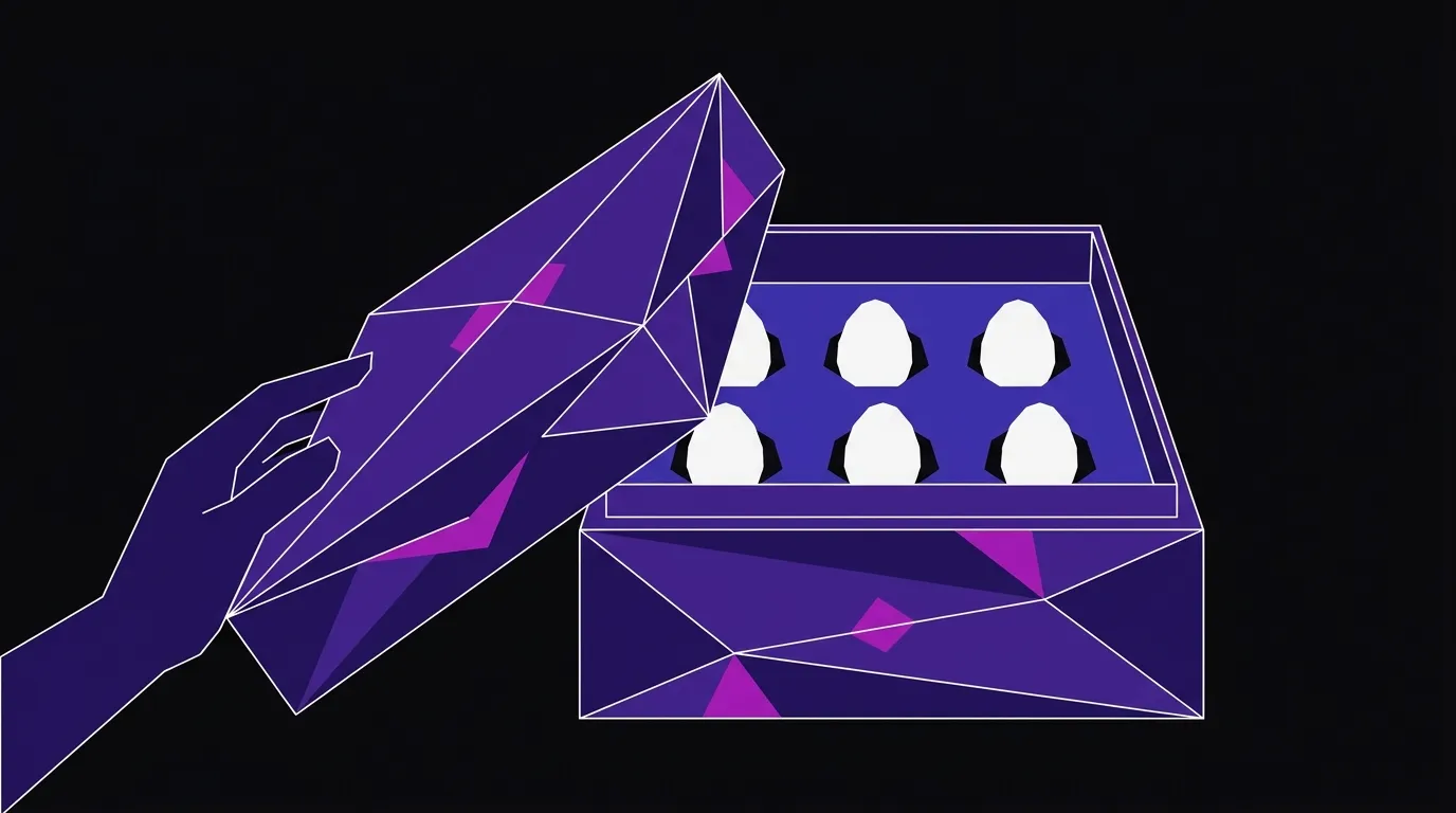
A commodity product proves the point: differentiation has to be visible before it’s legible
What The Dieline covered about Wild Lady Eggs is worth unpacking carefully, because eggs are the hardest possible category to make this argument in.
Kingdom Sparrow replaced the standard farmhouse-illustration carton with a rich burgundy box featuring shimmering gold artwork — a woodland nymph reaching toward a hen, surrounded by tiny illustrations of leaves, feathers, and footprints. The bespoke carton, developed with Blackmore Printers, opens to reveal six eggs in a specially shaped interior. The experience feels like unwrapping a gift rather than grabbing breakfast.
Wild Lady Eggs come from hens that roam freely through a woodland habitat. That’s a real differentiator — but it’s a differentiator that dozens of egg brands also claim, usually in small text on the back of a standard carton. The packaging makes that differentiator visible and felt before the customer reads anything. The burgundy and gold communicate “this is not the same as the egg next to it” in the same fraction of a second that Mother Design is talking about. The custom interior reinforces it through the physical act of opening the box.
This is the question every established product brand should be asking: does your current packaging make your actual differentiator visible at shelf distance? Or does it look like a slightly better version of the category default, leaving customers to do the work of figuring out why you’re worth more?
Structure and surface have to be designed together — or one will undercut the other
The Wild Lady Eggs example also illustrates something that surface-level packaging conversations miss: the interior of the carton was custom-shaped so the eggs nest in a specific way. That’s not decoration. That’s the packaging reinforcing the premium story through the physical experience of opening it.
Surface graphics are the first layer — the visual language that works at shelf distance and creates initial recognition. How a package opens, feels, and reveals its contents is the second layer, and it’s the one that confirms or undercuts what the surface promised. A beautifully printed box that opens awkwardly or reveals a generic interior sends a mixed signal. The most common version of this mistake is commissioning the graphic refresh first and handing the finished artwork to a packaging supplier — at which point structural constraints force compromises that undercut the design. By then, the budget is spent and the brief is closed.
When surface and structure are developed together, every detail — color, form, material, reveal — tells the same story and compounds the effect. That’s not a higher budget. It’s a better sequence.
A brand refresh is the right moment to fix packaging — not after
Packaging rarely gets redesigned in isolation. Usually it’s part of a broader moment: a product line expansion, a move into new retail channels, a brand refresh that’s updating the logo, the website, the whole visual system. That’s exactly the right time — when the identity is being reconsidered holistically, packaging gets to be part of the system rather than a one-off project that doesn’t quite match anything else.
If you’re working through a brand refresh and packaging is part of the picture, the work we do in graphic design and branding covers exactly this — from the identity system that packaging needs to draw from, to the print-ready files that go to production. Getting that work done in one integrated pass is how you avoid the structural-compromise problem entirely.
The standard is visible before legible. If your packaging requires a customer to read the fine print to understand why you’re worth more, the packaging is doing the wrong job — and no amount of ad spend fixes a problem that happens at the shelf.
Your packaging should do more work
We design packaging and brand identities that hold together from shelf to unboxing. If you're refreshing your brand or moving into new retail channels, let's talk about what your packaging needs to say.