Beyond the Chat Box: Why Your Brand Needs Better AI Interfaces
Generic chat boxes are the lazy default for AI features. Here's why intentional, brand-specific AI interfaces win—and how to design them right.

Every AI feature announcement right now looks the same: a text box, a blinking cursor, and a prompt that says “Ask me anything.” It’s the design equivalent of handing someone a blank piece of paper and calling it a product. The chat interface became the default because it was fast to ship and familiar to users. That’s a reasonable starting point. It’s a terrible place to stop.
The brands that will look thoughtful a year from now are the ones designing AI experiences around what their users actually need to accomplish — not around what was easiest to bolt on.
The Chat Box Is a Shortcut, Not a Solution
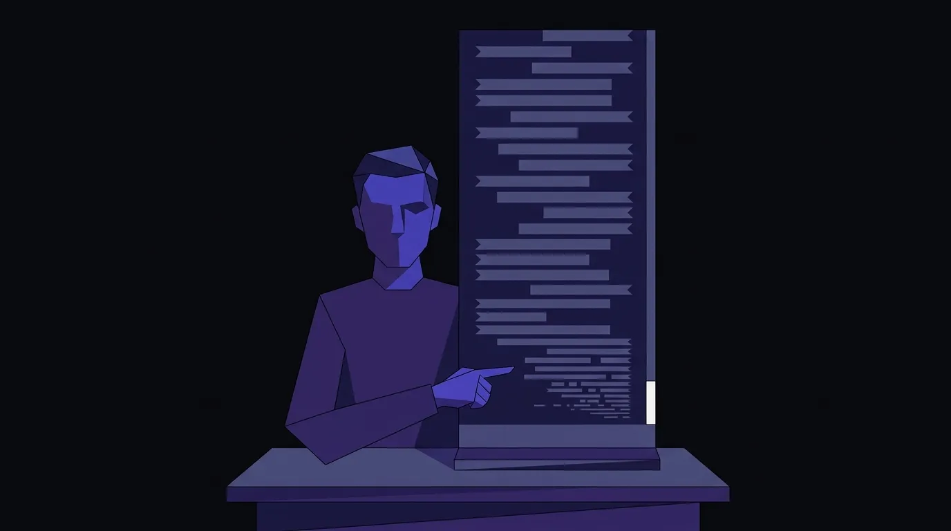
Product designer Maxim Kich made the case plainly in a UX Collective essay: when a conversation grows long, the scrollbar shrinks, context collapses, and real decisions get buried under dozens of model responses. The interface that was supposed to help starts actively working against the user. His diagnosis — “all of this intelligence is trapped inside a messenger, like a chatbot from 2015 but on steroids” — is worth sitting with.
The problem isn’t that conversational UI is bad. It’s that it’s being applied to tasks it was never designed for. A chat thread is a fine way to answer a quick question. It is a poor system of record for complex workflows, multi-step decisions, or anything where a user needs to see the state of their work at a glance. When a brand drops a chat box into a product that requires real task management, they haven’t designed an AI experience — they’ve deferred the design problem to the user.
Utility and Personality Are Not Opposites
One of the more instructive examples of rethinking AI interface design comes from MacPaw’s work on their AI assistant Eney, documented in detail by Smashing Magazine. The team’s starting premise was straightforward: the standard conversational textbox is “comfortable and familiar,” but interacting with it “can feel transactional and technical.” They wanted something more personal and differentiated.
Their solution wasn’t to add more features to a chat window. It was to replace the paradigm entirely with a character-based interface — an expressive, animated figure designed to convey state, emotion, and task progress through visual cues rather than text. They made deliberate choices about color (pink instead of the ubiquitous AI blue, specifically to stand out), motion (reduced to avoid distraction), and emotional range (a defined set of expressions that carry actual information, not decorative animation). The result is an AI tool that communicates through design rather than defaulting to words for everything.
The lesson for brands isn’t “add a mascot.” It’s that every design decision — shape, color, motion, interaction model — is a choice about how your users experience intelligence. Leaving those choices to a default chat template means you’ve made no choice at all.
Your Brand Can’t Survive in a Generic Interface
There’s a compounding problem here that goes beyond UX. When AI agents start building and rendering interfaces on your behalf — which is already happening — a generic chat box doesn’t just feel bland, it actively erases your brand. As Patrick Neeman writes in UX Collective, when you ask a coding agent to build a screen without a written source of truth, it reaches for “some gray Material button, a shadcn card, a stack of defaults that belong to no brand in particular.” That’s not the agent failing — it’s the agent working from nothing.
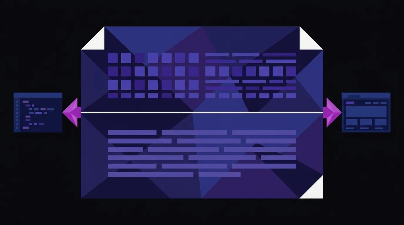
The fix Neeman proposes is a DESIGN.md file: a plain-text document, checked into your codebase, that defines your visual identity in two layers. The top half is machine-readable tokens — your exact color values, type scale, spacing, corner radii. The bottom half is human-readable prose that explains the reasoning: why your primary color is what it is, what “one action per screen” means for your buttons, when a designer is allowed to break the grid. The tokens tell an agent what to build; the prose tells it why. Strip either layer out, and you get generic output regardless of how detailed your Figma file is.
Google Labs open-sourced the DESIGN.md format in April 2026, which means the tooling is already moving in this direction. Brands that document their identity this way now will have a meaningful head start when AI-assisted development becomes the norm on their projects.
What “Intentional AI Interface” Actually Means in Practice
Putting this together, there are three things a brand should be asking before shipping any AI feature:
Does the interface match the task? A chat box is appropriate when the user genuinely needs open-ended dialogue — customer support, exploratory Q&A, brainstorming. It’s the wrong choice for structured workflows, form-driven processes, or anything where the user needs to track state across a session. Match the interaction model to the actual task, not to what’s fastest to implement.
Does the interface carry your brand? Color, typography, motion, personality — these aren’t decorations on top of an AI feature. They’re how users decide whether this tool feels like it belongs to your product or was pasted in from somewhere else. MacPaw’s team made dozens of deliberate decisions about Eney’s appearance precisely because they understood that the interface is the brand experience.
Is your identity legible to the systems building your product? If your design tokens live only in Figma and your brand rationale lives only in a senior designer’s head, you’re one AI-assisted sprint away from a codebase full of gray Material buttons. A written, machine-readable source of truth isn’t a nice-to-have — it’s defensive infrastructure.
This is exactly the kind of thinking we bring to web design and development projects — not just what an interface looks like, but whether every interaction model is the right one for what the user is actually trying to do.
The Default Is Already Crowded
Every brand that ships a generic chat box is making a bet that users won’t notice, or won’t care. That bet is getting worse. As AI features proliferate, the contrast between a thoughtless implementation and a considered one becomes more obvious, not less. Users are developing intuitions about what good AI interaction feels like — and “another text box” is starting to register as a signal that the team didn’t think hard about their needs.
The brands that will stand out aren’t the ones with the most AI features. They’re the ones whose AI features feel like they were designed for a specific person, doing a specific thing, in a specific context. That requires actual design work — interface decisions, brand decisions, and documentation decisions — not just an API call and a chat window.
The chat box had a good run as a placeholder. It’s time to replace it with something that was actually designed.
Design AI Experiences That Fit Your Brand
We design and build web experiences where every interaction — AI-powered or not — is intentional and on-brand. If you're adding AI features to your product or site, let's make sure they actually feel like yours.