Five Packaging Design Mistakes That Kill Shelf Presence
Good packaging design isn’t just about looking nice. These five packaging design mistakes are costing small brands sales — and most of them are easy to fix.
Most small brands lose the sale before the customer ever picks up the product. Not because the product is bad. Not because the price is wrong. Because the packaging isn’t doing its job.
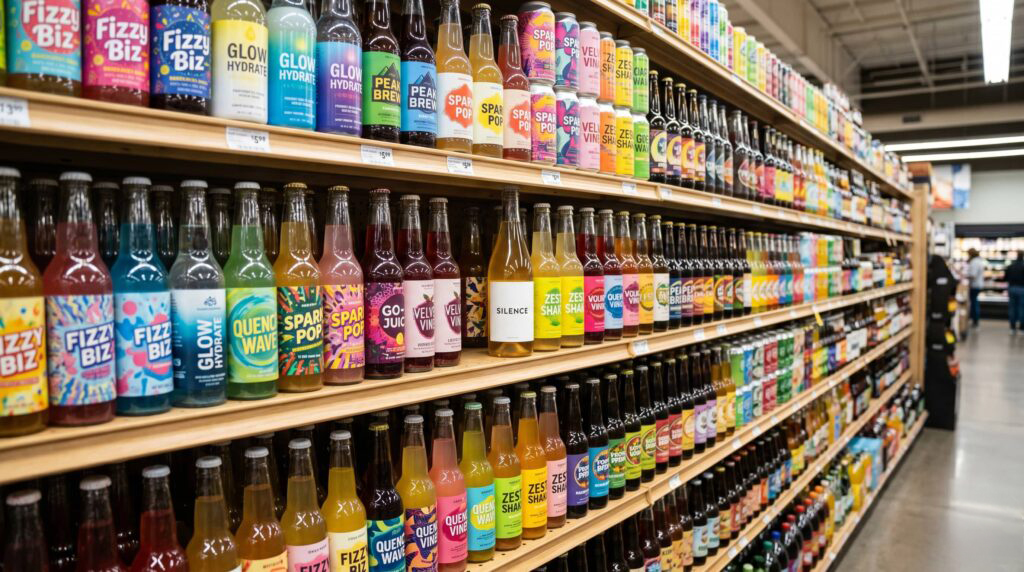
The shelf is one of the most competitive environments in retail. Over 70% of purchase decisions happen at the point of sale — meaning your packaging is, in many cases, the only sales tool you have. It has roughly three seconds to stop a shopper, communicate what the product is, establish why it’s worth buying, and build enough trust to earn a pick-up. That’s a lot to ask of a label.
We’ve designed packaging for brands across food, beverage, cannabis, and consumer goods — and the same mistakes come up again and again. Here are the five packaging design mistakes we see most often, why they kill shelf presence, and exactly what to do instead.
Mistake 01: Packaging Design Overcrowding — Trying to Say Everything at Once
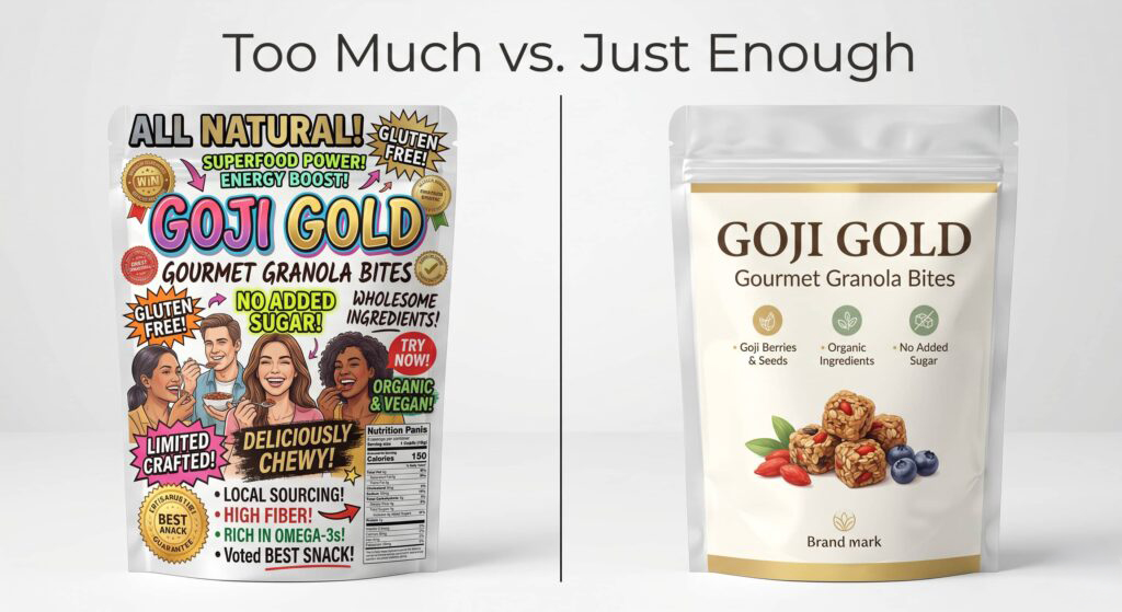
More information feels safer. If the front panel covers every feature, every certification, every claim, and every selling point, surely the customer will find something that resonates — right? In practice, the opposite happens. A cluttered package communicates nothing clearly, so the shopper’s eye moves on.
As Confetti Design Studio puts it, shoppers process visual cues extremely fast. When a label tries to say everything at once, the hierarchy collapses — and without hierarchy, there’s no clear entry point for the eye. The shopper doesn’t read your packaging. They scan it. If nothing jumps out in the first glance, you’ve already lost them.
The front panel of your packaging has one job: communicate the single most important thing about your product as clearly and quickly as possible. Everything else is secondary. The name. The benefit. The visual. That’s the hierarchy. Everything that doesn’t serve those three elements needs to move to the back or the side.
The Fix
- Establish a strict front-panel hierarchy: product name, primary benefit, visual. One message leads.
- Move certifications, ingredients, and secondary claims to the back panel.
- Apply the three-foot test: stand back three feet from your mockup. What registers first? That should be your primary message.
- When in doubt, remove. Restraint reads as confidence.
Mistake 02: Packaging Design Blending In: Looking Just Like Your Competitors
This one is subtle because it often happens for understandable reasons. Small brands look at the category leaders and model their packaging after what’s already working — the same color family, the same structural shape, the same typographic conventions. It feels safe. In reality, it makes you invisible.
When your packaging looks like the competition, you’re not just failing to stand out — you’re actively training shoppers to see you as interchangeable. MAVRK Studio notes that one of their food and beverage clients was struggling with slow shelf velocity until they revamped their design with bolder graphics and a differentiated color scheme. The product hadn’t changed. The category positioning hadn’t changed. The packaging had — and sales followed.
The goal of packaging design isn’t to fit into your category. It’s to stand out within it. That requires actually studying what’s already on the shelf — not to imitate it, but to identify the visual conventions every brand is following and then deliberately break them in a way that still makes sense for your product.
“When packaging is driven by ego instead of insight, the customer is the one who pays — and eventually walks away.” — MAVRK Studio
The Fix
- Conduct a shelf audit before designing. Photograph your actual competitive set in the actual retail environment.
- Identify the dominant visual conventions in your category — color families, structural formats, typographic styles.
- Design deliberately against those conventions in at least one meaningful dimension: color, typography, or structure.
- Differentiation needs to be brand-right, not just different for the sake of it.
Mistake 03: Packaging Design Typography Mistakes: When Your Label Can’t Be Read
Decorative fonts. Text over busy backgrounds. Type sized for a design screen, not a retail shelf. These are among the most common — and most fixable — packaging design mistakes out there, and they do quiet, consistent damage every single day.
The logic is simple: if reading feels hard, buying feels risky. A shopper who has to squint at your label to figure out what they’re holding is a shopper who’s about to put it back. Low contrast text, overly decorative typefaces, and undersized copy all create the same friction — they make the product feel harder to understand than it needs to be, and in a shelf environment where dozens of alternatives are within arm’s reach, that friction costs you the sale.
Typography in packaging design should do two things well: establish personality and ensure legibility. Both matter. A font can be beautiful and still be readable from three feet away with adequate contrast. If you’re sacrificing one for the other, you’ve made a design decision that the customer will ultimately pay for.
The Fix
- Test your type at print size, not screen size. What looks readable at 100% zoom often disappears on a physical label.
- Maintain a minimum contrast ratio of 4.5:1 between text and background for front-panel copy.
- Reserve decorative typefaces for display use only — product name, tagline. Body copy and claims should always use a legible, well-spaced face.
- Check readability under retail lighting conditions, which are often far harsher than studio light.
Mistake 04: Packaging Design Inconsistency Across Your Product Line
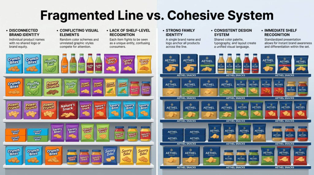
This mistake is almost exclusively a problem for brands with multiple SKUs, and it’s one that grows more costly the more a line expands. When each product in your range has been designed at a different time, by a different hand, or without a unified system, the brand stops reading as a brand on the shelf. It reads as a collection of unrelated products.
The impact is concrete. Inconsistent packaging design causes weaker brand recognition, fragmented shelf presence, and reduced cross-selling opportunities — every one of which has a direct effect on revenue. When a satisfied customer goes back to the shelf looking for another product from the brand they loved, they need to be able to find it at a glance. If the visual system doesn’t hold across the line, that recognition fails.
SmashBrand makes a critical point about this: packaging doesn’t exist in isolation. It exists as part of a shelf set, a product family, and a brand system. Designing each SKU in a vacuum — without considering how it relates to its siblings on the shelf — is one of the easiest ways to undermine a brand’s cumulative impact.
The Fix
- Build a packaging design system before you design any individual SKU: define logo placement zones, color hierarchy, typography rules, and imagery style.
- Use a consistent structural or visual device that ties the line together — a color band, an illustrative element, a typographic treatment — while allowing individual products to differentiate by variant.
- Conduct regular packaging audits. Review all SKUs together, not in isolation, to catch drift before it compounds.
Mistake 05: Packaging Design Testing Failure: Designing for the Mockup, Not the Shelf
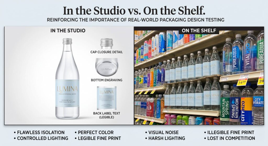
The most confident packaging mistake is also the most avoidable: approving a design that looks great in a digital mockup without ever testing it in a real shelf environment. SmashBrand describes this as designing in isolation — and the consequences show up the moment the product hits retail. Colors that looked vivid on screen can appear flat under fluorescent lighting. Labels that felt spacious in Illustrator get crowded when stacked on a shelf at eye level. A design that reads beautifully as a standalone object disappears when surrounded by twenty competitors.
The digital channel adds another dimension to this problem. A label that works at full size on a physical shelf may become illegible as a two-inch product thumbnail in an e-commerce listing. As more purchase decisions happen online, packaging design needs to work in both environments — not just one.
The Fix
- Print your packaging at actual size and view it under retail lighting before finalizing any design.
- Create a simulated shelf set: print your product alongside printed representations of your competitors and evaluate from three feet.
- Test your label as a small digital thumbnail — the size it will appear in most e-commerce search results.
- Get eyes on it that aren’t yours. You’re too close to the design to see it the way a shopper will.
Good Packaging Design Is a Strategy, Not an Afterthought
The five packaging design mistakes above share a common root: they treat packaging as a production task rather than a strategic one. Something to finalize after everything else is figured out. But packaging isn’t the last step in a product launch — it’s one of the most important ones.
In a retail environment where shoppers make decisions in seconds and alternatives are everywhere, packaging design is your first sales rep, your brand ambassador, and your product’s handshake with the customer — all at once. Getting it right isn’t optional for small brands trying to compete. It’s the difference between a product that moves and one that sits.
“Brands don’t fail in the market. They fail on the shelf long before a customer ever picks them up.”


Ready to Build Packaging That Actually Sells?