What the Latest Web Design Trends Actually Mean for Small Business Sites
Every year brings new trends. Not all of them are worth following. Here’s an honest breakdown of what’s worth your attention in 2026.
There’s no shortage of articles telling you what’s trending in web design. Tactile brutalism. Dopamine colors. Kinetic typography. Organic anti-grid layouts. Each year the list gets longer, the terminology gets more dramatic, and most small business owners end up doing nothing — because it’s genuinely hard to figure out which trends actually apply to a plumbing company in Montebello or a boutique retailer in Silver Lake.
So here’s a different take. We’ve gone through what designers, studios, and industry analysts are tracking for 2026, and we’ve filtered it through one question: does this actually matter for a small business website? For each trend, we’ll tell you what it is, show you where you’ve already seen it, and give you a straight verdict on whether it’s worth pursuing.

The Big Picture: What’s Actually Driving 2026 Web Design Trends
Before getting into specifics, it’s worth understanding what’s actually behind this year’s design direction — because the trends don’t exist in a vacuum.
Two forces are colliding in 2026. On one side, generative AI has flooded the internet with template-built, algorithmically smooth websites that all look roughly the same. The visual baseline has genuinely flatlined. On the other side, users are reacting — craving design that feels human, textured, imperfect, and intentional. Warm over cold. Character over polish. Personality over perfection.
“AI is in the mix, but instead of making web pages feel cold and machine-led, it’s sparking a push for designs that are warm, imperfect and full of character.” — VistaPrint Design Experts, 2026
At the same time, Google and AI search engines are getting more aggressive about performance. Page speed, clean code, and accessibility are no longer just best practices — they’re ranking signals. The sites that win in 2026 will balance visual differentiation with technical discipline. That balance is exactly where thoughtful small business web design lives.
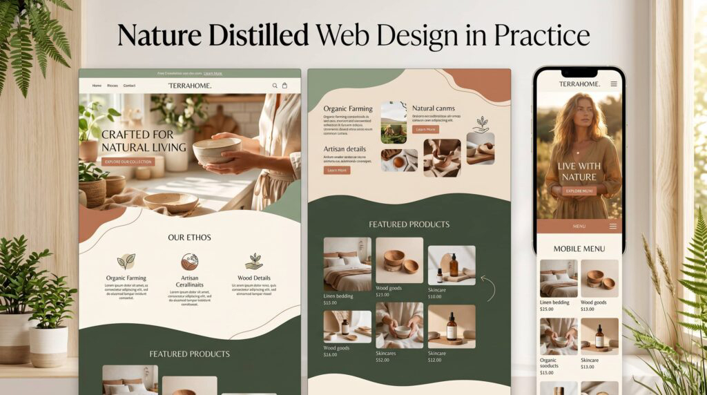
01 Nature Distilled: Organic, Earthy & Warm Web Design
After years of stark white minimalism and electric neons, the web design world is softening. The “nature distilled” trend brings muted, earthy palettes — think clay, warm beige, wood tones, and soil — paired with organic shapes, flowing layouts, and typography with a human quality.
It’s no coincidence that Pantone’s Color of the Year for 2026 is Cloud Dancer, a soft, creamy off-white. You see this web design trend on sites like Gormley & Gamble, a UK womenswear brand that uses neutral tones to evoke calm and authenticity, or in the broader wave of wellness, food, and lifestyle brands moving away from sharp grids toward layouts that breathe.
What it looks like: Warm neutral color palettes. Irregular, asymmetric layouts. Handwritten or humanist typefaces. Textured backgrounds that suggest paper, linen, or stone. Imagery shot in natural light.
✓ Go For It
This is one of the most accessible web design trends in years. It works for a wide range of small businesses — food, wellness, professional services, retail — and it doesn’t require complex development to execute. If your brand runs warm, this is your moment.
02 Expressive Typography: Type as the Hero Web Design Element
Typography has always mattered in web design — but in 2026 it’s being elevated from a supporting element to the primary visual. Brands are using oversized headlines, viewport-scaled fonts (where a single word stretches the full width of the screen), variable fonts that shift weight and width as you scroll, and kinetic type that animates in response to user interaction.
You’ve seen this expressive typography web design trend in editorial brands, high-end agencies, and fashion labels. Think massive single-word hero sections, letters that compress and expand as you scroll down, and headlines that do the work normally left to photography.
What it looks like: Giant, confident headline type. Minimal imagery in hero sections. Scroll-triggered font animations. Mix of ultra-heavy and ultra-light weights in the same layout. Custom or variable typefaces.
○ Adapt It
Full kinetic typography requires development resources most small business sites don’t have or need. But the underlying principle — letting strong, confident type carry visual weight — is absolutely worth bringing into any site. Oversized headlines and bold typographic hierarchy are achievable in any page builder and immediately elevate a web design.
03 Dopamine Colors: Bold, Saturated & Unapologetic Web Design
Quiet luxury had its run. Now color is back in web design — and it’s loud. The dopamine color trend brings bright, saturated palettes fueled by Y2K nostalgia: neon gradients, high-contrast pairings, electric greens and pinks, and layered color washes that feel almost physical. Brands like Lush, Headspace, and Starface have built entire visual identities around this energy.
It’s a counterreaction to years of muted, safe web design — and in the right hands, it’s genuinely memorable. The risk is that it tips into visual chaos if the underlying brand system isn’t solid.
What it looks like: Bright primary colors used at full saturation. Color-blocked sections. Neon accents on dark backgrounds. Gradient overlays on photography. Playful, high-energy visual rhythm.
○ Adapt It
This web design trend is brand-dependent. If your business is in lifestyle, food, youth-facing retail, or fitness, a dose of bold color is a genuine differentiator. If you’re a law firm, financial advisor, or medical practice, skip it. The principle to take regardless: don’t be afraid of color. A strong, intentional palette — even a restrained one — beats generic blue-and-white every time.

04 Tactile Brutalism: Raw, Geometric & Anti-AI Web Design
This is the most visually aggressive web design trend of 2026. Tactile brutalism is a direct reaction to the soft, rounded, AI-generated aesthetic that’s flooded the web. It leans into raw geometry, high-contrast black-and-white palettes, thick 1px borders, stark typefaces, and physical textures like grain and noise — all deliberately signaling that a human made this.
You’ll see this web design trend most on design studios, creative agencies, and editorial platforms that want to project engineered precision and attitude. It’s intentionally uncomfortable, and that’s the point.
What it looks like: Black borders everywhere. High-contrast black/white. Grainy or noisy textures. Asymmetric layouts. No soft drop shadows. Aggressive, editorial type. Zero decoration that isn’t structural.
✕ Skip It (for most)
This web design look is built for a specific type of brand — one that wants to project edge, rebellion, and raw craft. Most small businesses don’t need that signal, and applying brutalism to a service business that needs to project warmth and trust will hurt more than help. The exception: if your brand has genuine edge and you’re deliberately trying to stand out in a conservative industry, a restrained nod to this aesthetic can work.
05 AI-Adaptive Web Design: Websites That Respond to Users
This is less a visual web design trend and more a behavioral one. AI-powered adaptive interfaces personalize what a user sees — the content, the CTAs, the order of information — based on signals like where they came from, what they’ve browsed, what device they’re on, and what time of day it is. The website acts as a co-pilot, surfacing the most relevant content for each visitor rather than serving everyone the same experience.
At the enterprise level this is sophisticated and expensive. But accessible versions — smart pop-ups triggered by exit intent, CRM-connected forms that adjust based on known contacts, dynamic CTAs that change based on traffic source — are already within reach for small businesses using modern CRM and automation tools.
What it looks like: Content that changes based on user behavior. Smart CTAs that adapt to traffic source. Exit-intent triggers. Personalized follow-up sequences initiated by site interactions. Conversational UI elements.
✓ Go For It
At the accessible level, this is exactly what a CRM-connected website with smart automation delivers. If you’re running GoHighLevel or a similar platform, you already have the infrastructure for this web design approach. The small business version doesn’t need machine learning — it needs intentional automation triggered by user behavior. This is one of the highest-ROI investments a small business site can make.

06 Performance-First Web Design: Speed Is the Feature
This one isn’t glamorous, but it might be the most important web design trend on this list for small business sites. As AI search engines get more sophisticated, page performance has become a direct ranking factor. Sites that load slowly, lean on heavy JavaScript frameworks, or serve unoptimized images are getting penalized — not just in speed scores, but in actual search visibility.
Forward-thinking designers are responding by treating performance as a web design decision from the start: choosing lightweight CSS over heavy JavaScript where possible, optimizing every image, eliminating bloat, and building architecturally lean sites. The result is a web design that looks clean because it is clean.
What it looks like: Fast, clean interfaces with no unnecessary animation. Optimized images (WebP, AVIF). Minimal plugin dependency. Core Web Vitals scores in the green. Lean, semantic HTML structure that AI crawlers can parse easily.
✓ Go For It
Non-negotiable in 2026. A slow website isn’t just a bad user experience — it’s an SEO liability and a trust signal problem. Every small business site should be running Google’s Core Web Vitals assessment and actively working toward green scores. If your current site scores poorly, that should be the first item on your web design redesign brief.
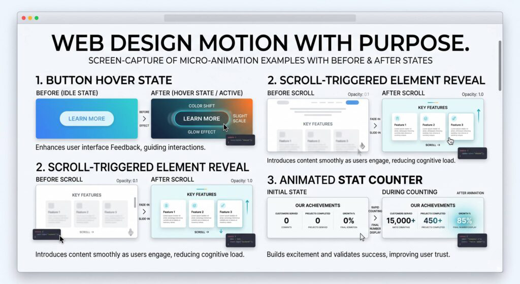
07 Micro-Animations: Web Design Motion With Purpose
Full 3D environments and WebGL-powered immersive web design experiences are getting a lot of press in 2026 — and they’re genuinely impressive on the right platform. Nike and IKEA use AR product previews. High-end agencies build scroll-driven narratives with 3D models. It’s remarkable work, and it’s almost entirely irrelevant for small business web design.
What is relevant is the smaller, more accessible version of this trend: micro-animations. Subtle hover states that respond to the cursor. Elements that fade or slide into view as you scroll. Buttons that give tactile feedback when clicked. These small web design interactions do real work — they make a site feel alive and considered without requiring complex development or tanking page performance.
What it looks like: Smooth hover effects on buttons and links. Scroll-triggered fade-ins. Animated counters in stats sections. Progress indicators. Subtle parallax on hero images. Loading animations that feel branded.
○ Adapt It
Leave the full 3D web design to Nike’s budget. Micro-animations, on the other hand, are one of the most effective ways to elevate a small business site from “functional” to “thoughtful.” The rule: every animation should serve the user, not distract them. If you can’t explain why an element moves, it shouldn’t move.
08 Retro & Nostalgic Web Design: The Dial-Up Revival
A growing corner of the web design world is looking backward for inspiration — specifically to early internet aesthetics, ‘80s excess, and analog print culture. Wix’s design team calls it “dial-up design” — a nostalgic counterweight to the frictionless polish of AI-generated everything. Grainy textures, vintage photography, lo-fi pixel elements, oversized serif fonts borrowed from old magazines, and the deliberately imperfect quality of pre-digital design are all showing up on modern sites.
You’ll see this nostalgic web design trend most on lifestyle brands, food and beverage, creative studios, and anything targeting a Gen Z audience that grew up romanticizing the analog world they never lived through.
What it looks like: Film grain overlays. Vintage photography and color grading. Serif-heavy typography with magazine layout influence. ‘80s color palettes. Deliberately retro UI elements like pixel fonts or CRT scan lines.
✕ Skip It (for most)
This web design approach is a brand-specific play. If your business has genuine nostalgia as part of its DNA — a classic diner, a vintage record shop, a heritage brand — the retro direction can be powerful. For most small businesses, it reads as a trend choice rather than an identity choice, and trend choices age quickly. If you’re going retro in your web design, make sure it’s because it’s authentically you, not because you saw it on a design blog.
The Small Business Web Design Filter: How to Choose Which 2026 Web Design Trends to Follow
Every web design trend in this list was born in a specific context — usually large brands with dedicated design teams, enterprise budgets, and audiences that expect cutting-edge digital experiences. Most small businesses operate with different constraints and different goals.
The question to ask about any web design trend isn’t “is this popular?” It’s “does this serve my specific audience, and does it align with what my brand is actually trying to communicate?” A law firm that goes all-in on dopamine colors isn’t being bold — it’s being confused. A restaurant that ignores the nature distilled web design trend in favor of cold, corporate minimalism is leaving warmth and appetite appeal on the table.
The web design trends worth following for almost any small business in 2026: strong, intentional typography, performance-first build practices, micro-animations used with restraint, and an honest earthy or brand-specific color approach. Everything else is conditional — worth exploring if it fits, worth ignoring if it doesn’t.
“The best-designed small business websites in 2026 won’t look trendy. They’ll look intentional.”
That’s the bar. Not trend-chasing. Not playing it safe. Intentional.


Want a Website That’s Built for 2026?